


Creating charts in Excel is quite easy: Select the data and choose your desired chart type on the ‘Insert’ ribbon. But when it comes to combining two chart types – for example a column chart with a line on top – many users suddenly struggle. But actually, it’s almost as simple as inserting a normal chart. Let’s have a look at how to do it and how to further adjust your chart.
Steps for combining two chart types
Creating a chart with two different chart types is comparatively simple in newer versions of Excel (the numbers are corresponding with the following picture):

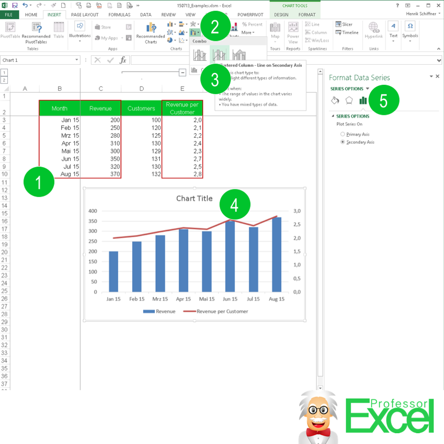
- Prepare you data. In this case, you have the data (column B, ‘Month’) for the x-axis in the first column. The second column (C, ‘Revenue’) contains the data for the columns of the chart. The last column (in this case the revenue per customer) has the data for the line graph which you want to show above the column chart.
- Click on Insert and click on Combo (on the charts section).
- Click on “Clustered Column – Line on Secondary Axis”.
- The result looks like no. 4.
If there is no ‘Combo’ chart type button…

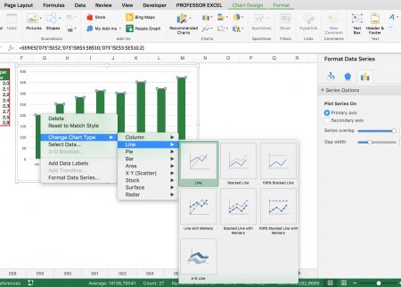
Sometimes the combo chart type is not available, for example in Office for Mac. In such case you have to create the combination of the two chart types manually:
- First set up a normal stacked column chart with all the data in it (also the data for the line chart).
- Next, click on the column in the chart which contains the values for the line chart.
- Right click on it “Change Chart Type” and select the desired chart type.
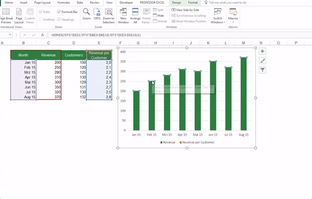
- Right click on the data series again and click on “Format Data Series”. The formatting bar should appear on the right hand side.
- Now you can further determine on which axis the line should be shown now: Select the secondary axis.
These steps work universally – also if you have a stacked or clustered column chart and want to display one series as another chart type.
Steps under Excel 2016
The chart menu has changed a little bit in Excel 2016. There are also new chart types available. The basic steps for creating combo charts are similar to before. Just follow the steps as shown above or this animation:

The gif above was too fast? Here are the steps in detail:
- Create a normal chart, for example stacked column.
- Right click on the data series you want to change.
- Click on “Change Series Chart Type”.
- Select your desired second chart type, e.g. line charts.
- If necessary set the tick at “Secondary Axis” if necessary.
- Confirm by clicking on OK.