


There is a simple way you can impress your boss, co-workers or clients: Use sparkline charts. Have you ever seen these tiny graphs within cells and want to use them too? Sparklines are a fast and elegant way to display your data in Excel. Inserting them into an Excel cell is also quite simple. Here is everything you need to know.
Insert sparklines in Excel in a single cell

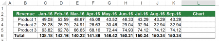
Before we jump right in: This is our example for sparklines charts. You want to insert small column charts in column L. So for example in cell L3 should be a column chart showing the values from cell range C3 to K3.

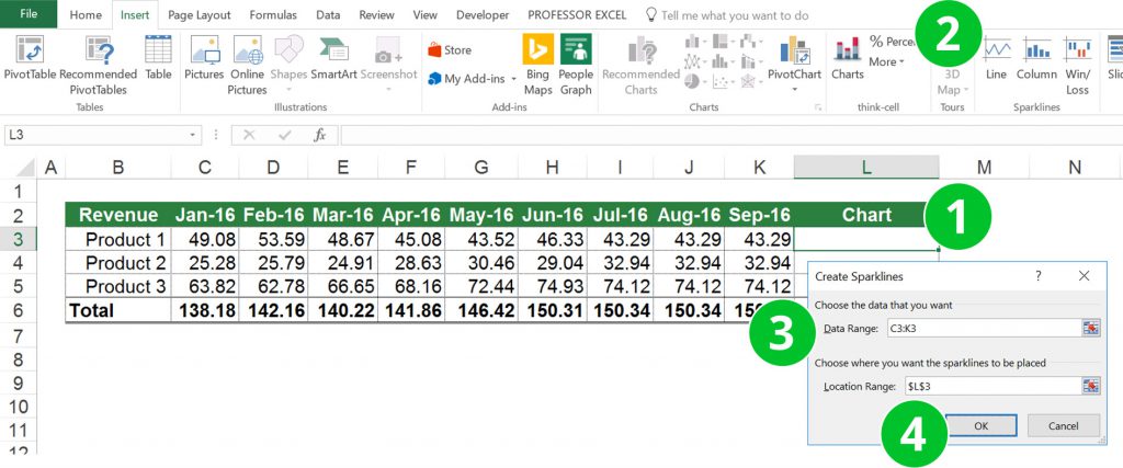
There are basically just five steps for inserting these small graphs an Excel cell. The numbers are corresponding to the picture above.
- Select the cell you want to create the small chart in. In this case it’s cell L3.
- Click on “Columns” within the “Sparklines” section on the Insert ribbon.
- Select the data for the chart. The Location Range should already say $L§3. If you want to copy these charts down to the cell below later on you shouldn’t use “$” signs for the Data Range.
- Confirm by clicking on OK.
Insert sparklines in multiple cells

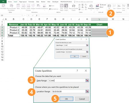
Adding sparklines for multiple charts is almost as easy as for a single cell. The only difference: Select the complete cell range. But let’s start from the beginning and go step by step.
- Select the complete range in which you want to insert small charts.
- Click on “Columns” within the “Sparklines” section on the Insert ribbon.
- For the Data Range select the complete cell range. In this example it’s the range C3 to K6 (not just the current row).
- For the Location Range, Excel should already suggest the correct cell range. It’s the range L3 to L6, in which your small charts will be located.
- Confirm by clicking on OK.
That’s it. Of course, you could also add a single chart first and copy and paste it down. But that way, the first sparkline chart (which you copy down) won’t be part of a group (scroll down for more information about sparklines groups).
Change the color of your sparkline chart

Do you want to change the default color of your sparkline chart? That’s quite easy:
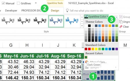
- Select the cell containing the sparklines you want to change the color of.
- Now the new ribbon “Sparkline Tools” opens.
- Just choose the color under “Sparkline Color” or select one of the styles.
Please note: All grouped charts will change their colors.
Define how to show hidden and empty cells

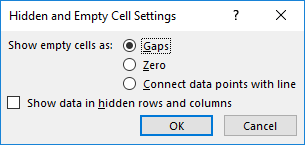
How do you want to show hidden and empty cells in sparkline charts? Select the sparklines you want to change and click on “Edit Data” on the left side of the “Sparkline Tools” ribbon. Now you can select between the following options:
- Show empty cells as gaps.
- Show empty cells as zeroes.
- If your sparklines are line charts, you can also choose to connect empty cells with a line.
Furthermore: You can select how to display hidden cells.
Highlight one or more values in your small chart
You can also highlight certain values with a different color. For example, you can highlight these values:
- High Point
- Low Point
- Negative Poins
- First Point
- Last Point
- Markers (Markers only work for the sparkline type “Line”

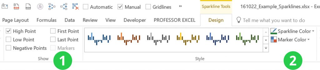
The steps are quite simple. After you’ve inserted a sparkline chart, click on it. The “Sparkline Tools” ribbon opens.
- Select the points you’d like to highlight. In the image above, only “High Points” are highlighted.
- Choose the color of the highlights by clicking on “Marker Color”.
Do you want to boost your productivity in Excel?
Get the Professor Excel ribbon!

Add more than 120 great features to Excel!
Group (or ungroup) sparklines in order to edit them simultaneously
Grouped sparklines have one major adavantage: You can edit the data, location, colors and so on simultaneously. On the other hand, you might want to format them individually so that you want to ungroup them.
So here is what you have to do for grouping or ungrouping sparkline charts in Excel.
Group:
- Select all sparkline cells you want to group (at least 2).
- Click on “Group” on the right hand side of the “Sparkline Tools” ribbon.
Please note: All grouped sparklines have the same type. So if they are not equal (for example one Line and one Column chart type), they will be made the same when grouping.

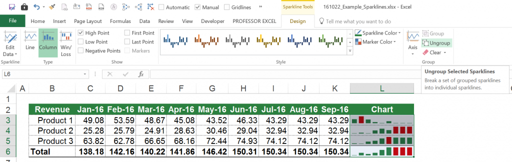
Ungroup:
- Select one or more cells you want to take out of an existing group.
- Click on “Ungroup” on the right hand side of the “Sparkline Tools” ribbon.
Change the data source of your sparklines chart

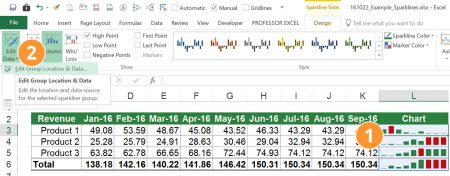
Let’s assume that you’ve added some data. Now you want to extend the sparklines to these new cells. Therefore you have to edit the sparkline data.
- Select the sparkline chart of which you want to edit the Data.
- In the “Sparkline Tools” ribbon, click on “Edit Data” on the left hand side. Depending if you want to change the data of the sparklines group or just the selected sparklines either click on the first (“Edit Group Location & Data…”) or the second item (“Edit Single Sparklines Data…”).
The familiar window of inserting sparklines opens and you can change the source data.
Set the same axis scale for sparkline charts

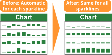
You can set the same scale of the axis of sparkline charts. This is especially useful, if you want to show the relation between them.

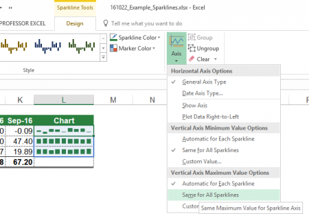
The condition: The sparklines must be grouped. Once they are grouped, it’s quite straight forward: Select on of the grouped sparklines and click on “Axis” within the “Sparkline Tools” ribbon. Set the tickmark of “Same for All Sparklines” (2x for minimum and maximum values).
Delete sparkline charts
There is only one topic left: How to delete sparkline charts. It doesn’t work just to press “Del” on the keyboard.
There are two ways:
- Deleting the complete cells contents and formats. Therefore click on “Clear” (the small rubber symbol) on the right hand side of the home ribbon. Next click on “Clear All”. Unfortunately, also other formatting will be lost.
- Only delete the sparklines. Select the sparklines and click on “Clear” on the right hand side of the yellow “Sparkline Tools” ribbon. You can further select if you want to clear the complete group or just the selected sparklines.
Conclusion
Sparklines are easy to handle as they don’t offer as many options as the complicated normal charts. But coming with their simplicity, they just give a rough impression: You should keep in mind that these sparkline charts don’t really let you see their corresponding values.
Many people don’t know sparkline charts. So when finalizing a worksheet, why don’t you try to use sparklines and impress your boss or client?