After finishing calculations in Excel, you want to present your results. In many cases, a PowerPoint presentation is the best way to show your tables and charts. There are many ways to export a table or a chart to PowerPoint. They all have advantages and disadvantages. In the following we will take a look at three strategies, compare them and provide a recommendation for you.
Strategy 1: Simple copy-and-paste (not recommended)
Method
The easiest way is to just copy your table or chart in Excel and paste it to PowerPoint. Follow these steps:
- Select the item (table or chart) you want to copy and press Ctrl + C on the keyboard.
- Open your PowerPoint slide.
- Paste it by pressing Ctrl + V on the keyboard.
That’s it. Sounds simple, right? But let’s take a closer look at the advantages and disadvantages.
Advantages:
- It’s the fastest of the three strategies.
Disadvantages:
- Please be careful with this methods: If you copy and paste charts, the complete Excel workbook is embedded into your PowerPoint slide. That means, all your data and calculations are available for anyone who has the PowerPoint presentation. You should make sure that there is no confidential content in your workbook.
- If you copy and paste a table range, the formatting will be lost: Neither will PowerPoint adapt the it to the standard formatting of tables in your slide master nor will it use the formatting from your Excel file.
- Newer versions of Excel will establish links to your file. You could press “Refresh Data” on the “Design” ribbon within the “Chart Tools” group in order to refresh it. But the links easily break once you rename the file, create new versions or send it by e-mail.
Strategy 2: Export from Excel to PowerPoint as images (recommended)
Method

If you choose to copy a table or a chart as a picture, there are two major advantages: It’s not linked to the data (well, in most cases that’s an advantage…) and the format is fixed. The format can’t be changed any more. Unfortunately the images often look ‘pixelated’. So, how to do export the charts and tables and keep a high quality?
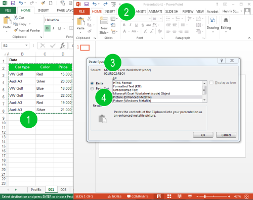
- Select the table or chart and copy it in Excel.
- Switch to PowerPoint.
- Insert it by pressing Ctrl + Alt + V (Paste Special).
- Now it’s crucial for the best quality to select “Picture (Enhanced Metafile)”.
Advantages:
- You can keep your Excel layout. Previously formatted charts and tables in Excel will look (more or less) exactly the same in PowerPoint.
- No linking: The data is not linked to Excel. That might be a disadvantage as well, but because the linking is usually very “unstable” and breaks easily, we count it as a disadvantage here.
- “What you see is what you get”: There are no hidden data or sheets embedded in your PowerPoint presentation.
- It’s usually faster than reproducing the charts and tables in PowerPoint (see Strategy 3 below).
Disadvantages:
- You always need the corresponding Excel file to update your data.
- The results might look slightly less beautiful compared to if you reproduce the charts and tables in PowerPoint (as in Strategy 3 below).
Strategy 3: Reproduce charts and tables in PowerPoint (recommended)
If you are going to reproduce the charts and tables from your Excel workbook in PowerPoint, you have to differentiate between tables/cell ranges and charts.
Tables
Please follow these steps for inserting a table using the built-in table format in Excel:
- Go to the “Insert” ribbon.
- Click on “Table” and define the size of the table.
- Now switch to Excel and copy the desired range of cells you’d like to export to PowerPoint by pressing Ctrl + C on the keyboard.
- Switch back to PowerPoint, select the new (still blank) table and press Ctrl + V on the keyboard.
Charts
Reproducing charts in PowerPoint works similar to creating charts in Excel:
- Go to the “Insert” ribbon.
- Click on “Charts” and select your desired chart type.
- Switch to Excel and copy the range of cells as the input data for your chart by pressing Ctrl + C on the keyboard.
- Go back to PowerPoint, select the small Excel window which opened when you inserted the chart in step 2 above. Paste the data into this window.
- That’s it. Now you can proceed with the fine-tuning of your chart.
Advantages:
- The results usually look the best and colors and layout is usually most consistent.
- There is no hidden data as if you embed the whole Excel file within your PowerPoint presentation (like in Strategy 1 above).
- Changing sizes (especially if the aspect ratio is affected) is simple.
- You don’t necessarily need the Excel file in order to update the charts and tables.
Disadvantages:
- Takes more time than Strategy 2 above.
Conclusion
- In most cases don’t simply copy and paste your Excel work into PowerPoint.
- If you are in a hurry: Choose Strategy 2.
- If you got some time, you could consider using Strategy 3.
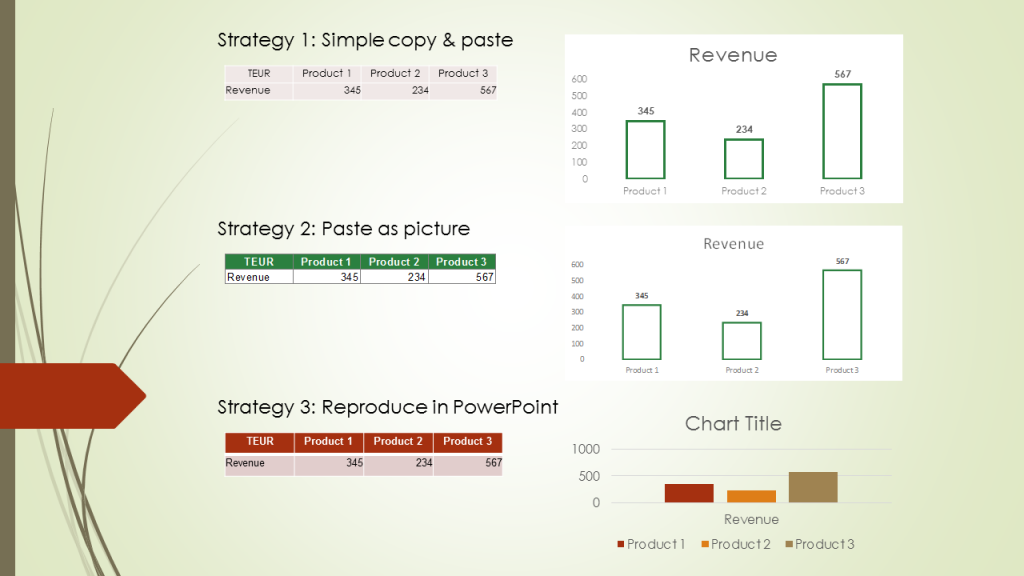
In comparison with a simple table and chart:


Though helpful for people looking to do business presentations, obviously the most frequent use of PowerPoint, it was not what I was looking for. So, on the off-chance that you may also know how to do the following and have a link to a page, may I ask…
I’m looking for a way to reduce inputting time and formatting time when making spelling review slides in PowerPoint.
I had the idea that exporting Excel (either with formatting or as a CSV file) to PowerPoint would mean that I can input rows/columns of text into Excel (word spelling and page or book chapter number etc) then export those to PowerPoint as above.
The idea is to spend perhaps an hour setting up Excel to export in a very specific format, then spend much less time inputting manually as it’s easy to import text into Excel.
Thanks for this useful page. It just isn’t what I as looking for.