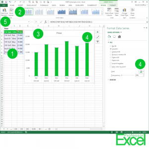
Once your calculations are done, you might want to show your results in charts. Charts are a good way of getting a feeling of the values and leading to conclusions.
Steps for creating charts in Excel
Creating charts in Excel is easy and painful at the same time. It is easy because you can create charts with a few clicks. It is painful because some settings and layout options are either hidden or simply not possible. These steps are necessary for creating graphs in Excel (the numbers are corresponding to the picture above):
- Select the data you’d like to show in a chart, include also the heading rows or columns.
- Click on the chart type you’d like to use on the Insert ribbon.
- Excel inserts the chart. Now you have to adapt the layout.
- If you want to change the color of the bars, double-click on the bars and you can change it on the right hand side. It works the same way for most other settings.
- If you want to add other items such as Axes Titles, Data Labels and so on, take a look at the Chart Design and Format ribbon.
Do you want to export your chart to PowerPoint? Then maybe you’d like to read about how to properly copy data or graphics to PowerPoint.

