
A histogram chart is a great way to present your data. It groups your data into bins or classes and shows the number of items per bin. For example: Your data has “Big Mac” prices in different countries. A histogram shows how many countries have a Big Mac price between 1 and 2 USD, 2 and 3 USD and so on.
This article introduces three methods in Excel how to create a histogram. Please also feel free to download all examples in an Excel file.
Example and download
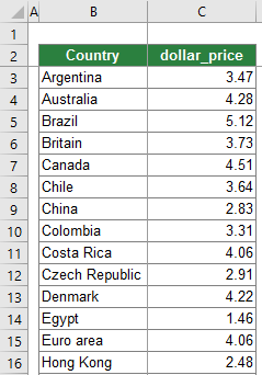
All 3 methods of how to create a histogram chart will be shown with a simple example. You got a table with two columns like shown on the right-hand side:
- A country name.
- The local price of a Big Mac, converted into USD.
The data is taken from this website. Please feel to download all examples in one Excel file. Just click this download link (file size: 48 KB).
Method 1: Use the built-in histogram chart type
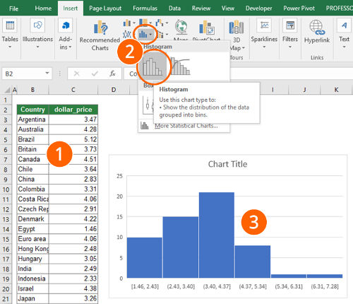
Since Excel 2016, there is a built-in chart type called “histogram”. It easily inserts a histogram. Just follow these steps:
- Select your data.
- Click on the histogram icon in the center of the “Insert” ribbon. Select the histogram chart.
- That’s it, you already got a histogram.
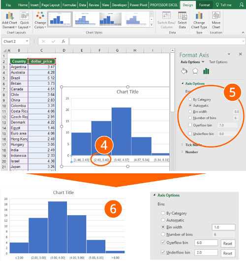
- Now you can start fine-tuning your histogram. To achieve this, double click on the x-Axis.
- On the right-hand side, you’ll see the “Format Axis” pane. Under “Axis Options”, you can set the main preferences.
- Most important is probably the “Bin width”. By default, it’s “Automatic”. You could switch it to “Bin width” and set the desired class width, e.g. “1 USD”.
- Alternatively, you can let Excel define the bins automatically or define the number of bins.
- Also important: Do you want to set an individual “underflow” bin or and “overflow” bin. Excel then summarizes all items below the underflow bin into one column on your chart.
- Number 6 on the screenshots shows the result, if you set the bin width to “1.0”, the overflow bin to “6.0” and the underflow bin to “2.0”. Now you can proceed defining the layout, e.g. colors, fonts and titles.
| Advantages | Disadvantages |
|---|---|
|
|
Method 2: Use a PivotTable and group the data
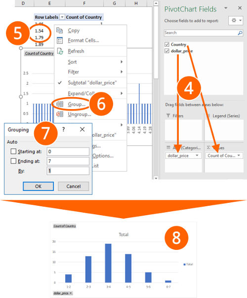
The second method also works with Excel versions before 2016. You insert a PivotChart and use the function to group the data. Follow these steps (the numbers relate to the pictures).
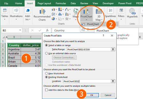
- Select your data.
- Click on “PivotChart” in the “Charts” section of the “Insert” ribbon.
- Make sure the settings are correct (the correct table range and the location is selected). Confirm with OK.
- You now see a blank PivotTable range and an empty PivotChart. Also, the “PivotChart Fields” pane on the right-hand side opens. If you can’t see the “PivotChart Fields” pane on the right-hand side, right-click into the empty PivotTable and click on “Show Field List”.
Drag and drop the numeric values into the “Rows” section. Then drag and drop the item names (here: “Country”) into the “Values” section. Make sure, that it says “Count of Country” instead of “Sum of Country”. If it doesn’t say “Count of…” (e.g. “Sum of…”), right-click into your PivotTable in the column of “Sum of Country”, click on “Summarize Values By…” and check “Count”. - Now right-click on any cell of the the “Row Labels” column.
- Click on “Group…”.
- Define your classes:
- “Starting at” is the minimum value, ending at the maximum value.
- “By” defines the class width.
To change the values later on, repeat from step 5 above.
- After clicking on OK, you see a chart similar to number 8. You can proceed with the layout of your chart.
| Advantages | Disadvantages |
|---|---|
|
|
Method 3: Prepare your data manually
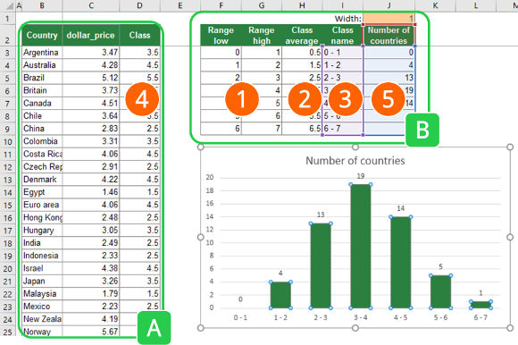
The concept of the third method is to prepare your data in a way that you only have to insert a simple column chart. Therefore, you have to prepare a table with the class limits and insert the class into your existing data.
Please look at the image on the right-hand side. As you can see, you got two tables:
- Table A contains your original table with an additional column for the class name.
- Table B contains the classes. For each class, it has the lower limit, the upper limit, the average, a class name as well as the number of items (here: countries). The final chart will only refer to the last two columns of this table.
Step by step:
- Create a table with your classes. You need to set a lower and an upper limit.
Recommendation: You could also make it dynamic, so that the user can define the class with (cell J1 in this example has the class with). E.g. cell C3 has this formula =F3+$J$1 . - In number four, you later on use the SUMIFS formula. You will then return the class average, which you insert into column H.
- Furthermore, you create another column in table B with a class name. This class name will be shown in your chart and should be easier to read.
- Insert the class average into a new column in your original data table. You can do this with this SUMIFS formula:
=SUMIFS(H:H,F:F,”<“&C3,G:G,”>=”&C3)
The SUMIFS formula returns the class average from column H under the following conditions: The value in column F (the lower range limit) is smaller than your search value (here the dollar_price in cell C3). The second condition is that the upper range limit (column G) is larger than the search value (again cell C3). Please refer to this article for more information about classifying data with the SUMIFS formula. - Add another column to table B. Count how many items of your original data in column A are within the range of each class. To achieve this, use the COUNTIFS formula:
=COUNTIFS(D:D,H3)
Now you can insert a column chart, using the class name for the x-axis and the number of items for y-values.
| Advantages | Disadvantages |
|---|---|
|
|
Recommendation

Which method is suitable for you?
- Your version of Excel is older than Excel 2016? Method 1 is not suitable for you. (Here is how to check the version of Excel you use).
- You are in a hurry? Check methods 1 or 2.
- You hate (or don’t know) PivotTables? Try methods 1 or 3.
- You are willing to spend some effort in order to create the best layout? Try method 3.